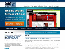
 I’m way (way) behind on announcing the new look and identity of Dao By Design, but cobblers’ kids and their shoes, eh?
So, welcome to the new look of Dao By Design. Slicker, more organized (or will be when we get everything in its place), more useful and generally just much much better.
Previously the site utilized Joomla for the main CMS and WordPress for the blog. With the CMS-focused improvements that WordPress development has brought over the last two years, we felt it was time to make the switch to a 100% WordPress-based solution.
Some new features:
- Knowledge Base: We started this under the old system, but it will be much easier to improve on using the new management system. While primarily this will be a space for us to provide articles of interest to our clients and potential partners, we hope it will also prove valuable for the random visitor that happens by as well.
- Our Work: Once finished this will provide a more fluid and easier to navigate rundown of projects we have been involved with. It will be replacing our old, scarcely updated “Portfolio” page.
- The Blog: In the 3+ years that the blog has been running, it has admittedly been a bit “all over the map” with its content. The new design brings with it a re-thinking of how we will utilize the blog as both a way to share advice and tips on design/coding with the community, as well as communicate our thoughts and opinions in the area of Web design and development.
- Contact/Quotes: We now have a mechanism for those wishing for quotes to provide more details directly in the initial contact. This is more time-economical on both ends as it saves us from having to send out the boiler-plate e-mail of “We’d be happy to provide you with a quote for your project, but we will require some additional details from you…”
- Free Plugins: Previously when we released a new plugin or update to one of our plugins it was all handled through the blog — not the most practical or expandable solution. This is now handled as its own independent area of the site; which is much more browseable in my opinion.
We’re also sporting a new logo:


The new logo was chosen for its cleaner layout, slightly leaner height, better colour scheme (particularly for display in different environments/media) and because I feel it just looks much nicer.
Well, that about sums up the changes. Thanks again to everyone who has visited recently and put up with our mess. We are working hard at getting the boxes unpacked and the pictures back on the shelf. We appreciate your patience.
