I recently finished the redesign of my blog, The Humanaught, and as these things tend to – it came with a few forehead slapping mind scratchers.
The key one being that the design utilized the post’s footer to store comments. On many posts you wouldn’t even know there was a problem, however when I – on occasion – veer from my usual rambling and only write a tiny little blurb, the issue is evident.
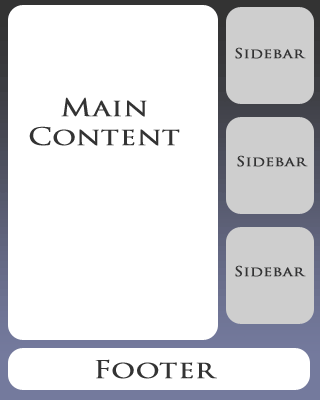
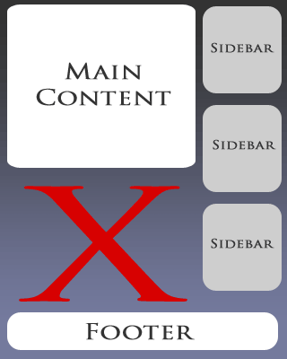
Take, for example, a standard page layout. On one side (in my case, the left) you have your content, on the other you have your sidebar, and hanging out at the bottom you’ve your footer (fig. 1). If your content and your sidebar have a roughly equal amount of doodats in them, you’re golden – but when you short change your comment box, your sidebar extends its full length and makes everything look goofy (fig. 2).
Not just goofy, but in my case, lacking functionality. As I want my readers to have quick access to the comments on each post, I needed to come up with a solution to this.
The Idea
Basically, the logic behind this is that depending on the length of the content I will either show or not show various elements in my sidebar. So, for example, if my post is rather long, I’ll display everything – recent comments, recent posts, blogroll, ads, etc. However, if my post is short, I bring out the axe.
We also need to take into account that the index.php (or Home page) should be immune to this process – as the page is generally long enough to accommodate even the most well-endowed sidebars.
Getting Started
The first thing I did was sat down with a pen and paper. I made a list of all the “elements” of my sidebar and then prioritized them.
One thing I tried to take into account is that on short posts I’d want to provide readers with a place to go to next, and preferring that it be on my site, I put things like Recent Posts and Recent Comments at the top of the list, with the the Blogroll and various badges near the bottom.
This isn’t about positioning, remember, just about prioritizing what bits are most important and should be displayed more frequently.
The Method
Digging into my WordPress template, I needed a dynamic way of determining the size of the content box. For this I threw the following code just above The Loop of my single.php and page.php pages.
I come out of that with a variable ($contlen) that gives me the character count of my content. Now all I needed to do was pass that variable to my sidebar and use some conditionals (IF bla bla bla) to decide what should be displayed and what should be cut.
The problem with the standard WordPress template is that the <?php get_sidebar(); ?> that WordPress uses by default to load all the goodies in sidebar.php doesn’t pass variables defined in other areas of the template.
To fix this we change:
to
Now any variables you set in single.php/page.php will carry over to sidebar.php.
Next up, we need to attribute some values to that prioritized list we made a bit earlier. We need to decide after what character count certain sidebar elements will be displayed. As this is all very much a “give or take” solution, figures will vary depending on things like font-size, the size of elements in the sidebar, etc. However, let’s use my numbers for the sake of … well… just because.
- All – Search Box, Recent Posts
- >1,000 – Badges
- >3,500 – Recent Comments
- >5,000 – Blogroll
To implement this, we just wrap the sidebar elements in IF statements:
 3500) { ?>
	Recent Comments
The IF statement simply says if it is the home/index.php (is_home()) or (||) our content’s length ($contlen) is greater than 3500, display this crap – otherwise, move along.
That about does it, but for the sake of re-illustration, here’s the conditional to display the blogroll:
 5000) { ?>
	Blogroll
What this doesn’t take into account are pages that display things like search results, particularly if those results are few to none. But with some simple modifications, I’m sure you can adjust this method to suit your blog’s particular needs.


16